en / de
Pangea
Thoughts behind a typeface that connects cultures and saves the environment
There are not too many geometric sans serifs, but too few.
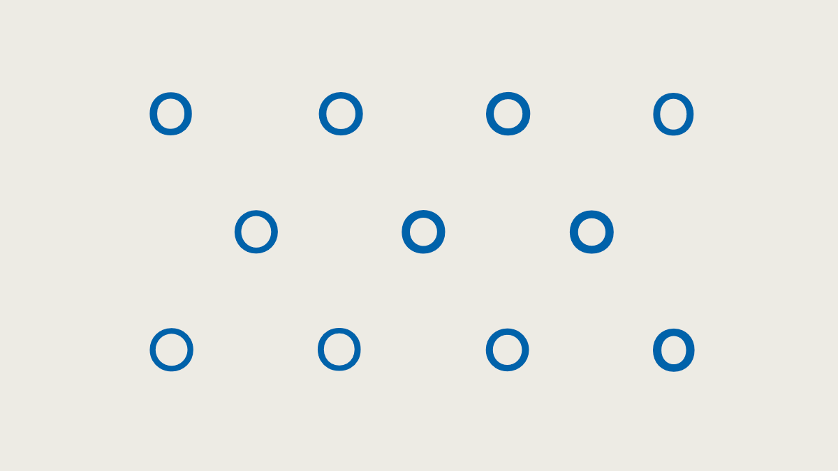
Yes, pretty similar: o’s from 11 of the currently most successful geometric typefaces.
Of course, for quite some time they have been growing like mushrooms, and we see them everywhere we turn. There are actually a lot of typefaces based on the circular o and some really good ones. But most of them have one thing in common: they are latin, static, and one-dimensional and they differ only slightly.
I didn’t want to design another one of these typefaces.
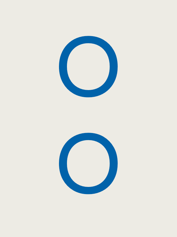
Not from an old type specimen book
Pangea is an extra special typeface for me. I thought about it from different perspectives, taking into account not only aesthetics and typography, but also technology, culture and sustainability.
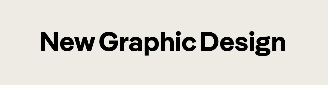
I didn’t intend to revive a historical typeface. Although I have great respect for the many of the existing revivals, in the case of Pangea, I wanted to stay away from direct influences as much as possible. Which is not to say there weren’t any, of course. Rather than being influenced by a historical typeface, it was the aesthetic of the closely set typefaces of the mid-20th Century that prompted the first sketches. It appealed to me to transfer their compactness to a straightforward geometric sans serif.
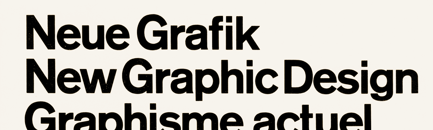
Title of the magazine Neue Grafik by Josef Müller-Brockmann, 1958–1965
Pangea Bold
I have kept the x-height relatively high, the ascenders correspond to the capitals, the spacing is tight and the letters are hardly open — this creates a consistently compact appearance. So that it doesn't look too strict, diagonal endings and round dots provide a friendly impression.

For me, the a in Pangea is a logical development of the a in the classic geometric sans serif Futura.
Tight! Compact! But, also legible.
Many typefaces seem somewhat indecisive in their attempt to please everyone, they neither want to be set too closely together in text nor fall apart in headlines. In order to stay true to the aesthetic path that I wanted to follow, I was left with two options: either it would be a font that would not work in body text (nay) or there would have to be an additional text variant (yay).
Optical sizes are by no means a new idea–before phototypesetting made fonts infinitely scalable, every size had to be physically produced (and optimised). Even today, very few fonts are adapted for different reading sizes – and it is very rare to find a sans serif. But there really isn’t a way around it if you want to realise a design idea without compromise. (For further reading, I highly recommend Tim Ahrens’ excellent Size-specific adjustments to type designs)
The Text variants of Pangea have larger apertures and run wider. Ascenders and descenders are more pronounced and where two straight lines meet there are subtle ink traps.
Maximum variable
Now, I am not only a type designer, but first and foremost a font engineer, and I am particularly interested in the interplay of design and technology. For several years there have been variable fonts that enable the user to continuously regulate certain properties of a font. In most cases, the existing range is limited to controlling the degree of weight, width and slope — yet the format can do so much more!
From the outset, I designed Pangea as a variable font as there are still so few of these in the geometric field.
Above a variable font (138kb), below 10 static ones (647kb).
Apart from the usual axes (Weight and Italic; width is in the works), things get interesting: the text styles are contained in the variable font and can also be conveniently selected as an instance according to the static fonts. However, I have divided their previously described peculiarities into different axes, which enable the interested user to set apertures, ascenders and descenders as well as spacing separately.
Handgloves
Try out Pangea as a variable font (Many thanks for the sliders, Roel!)
For geeks: I have developed a special concept with the stylistic set axes. If alternative forms (such as a, g and l in Pangea) are otherwise only controlled via OpenType features that are difficult to reach in UIs, I have implemented them here additionally as (on/off) axes. This not only makes it possible to switch on the alternative g in the text instances, but also to define special instances (which do not exist as static fonts): Pangea Simple, where the alternative forms completely change the character of the font.
Connecting Cultures
“Pangea” is not only a beautiful and visually representative name, it also stands for global cooperation, just like the primeval continent it was named after.
So, it goes without saying that I wanted to concern myself with more than just aesthetics and technology. As mentioned, there are many geometric sans serifs, especially in areas where the predominant languages are Latin-based but language support quickly stops beyond the borders of the most economically strong countries.
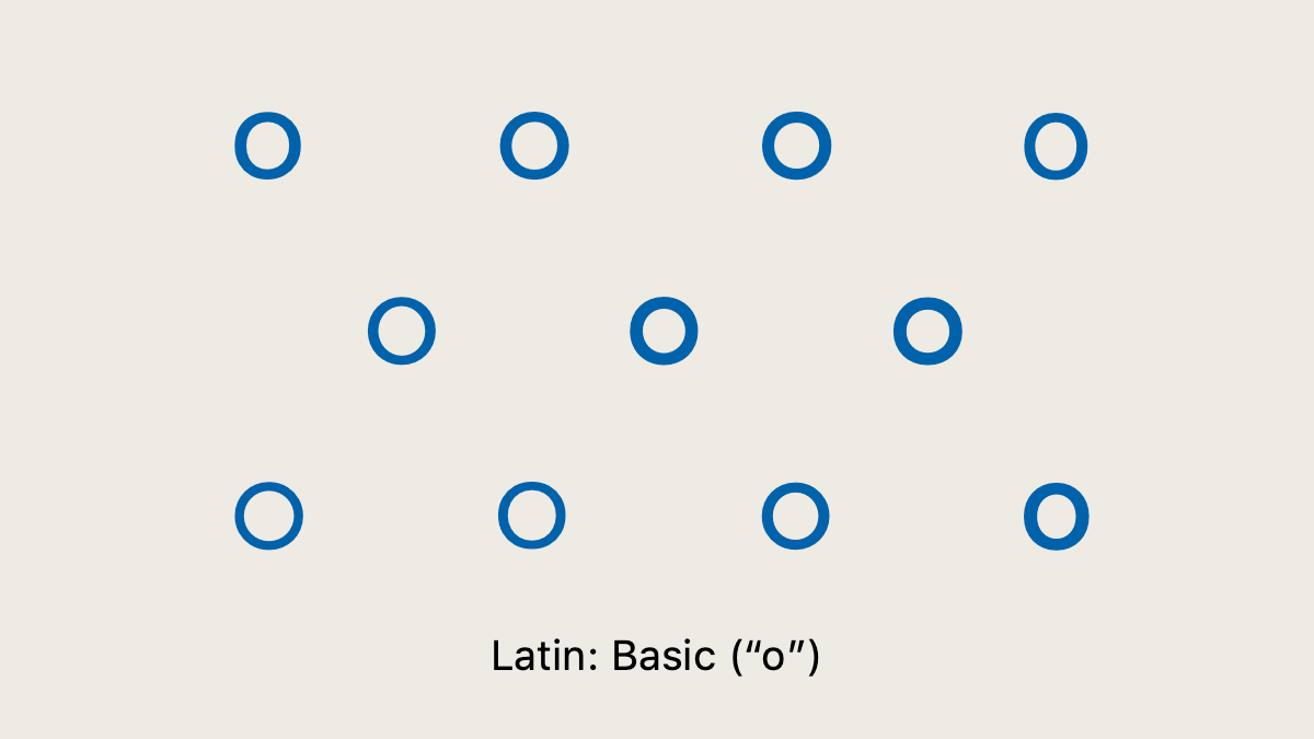
Eleven of the currently most successful geometric fonts and their (missing) language support.
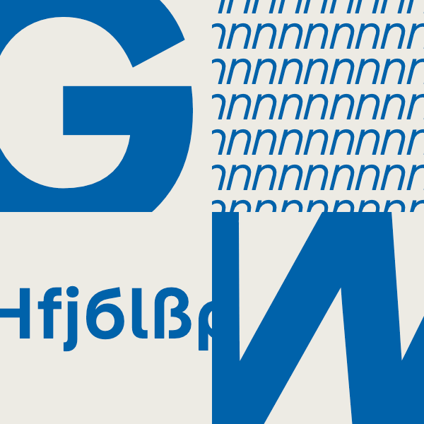
Pangea goes one step further: Since its release Vietnamese and Latin characters for transcribing e.g. Arabic and Sanskrit, as well as Greek and an extended Cyrillic (which also includes often ignored languages, such as, Kyrgyz or Bashkir) have been supported.
Pangea should be culturally connecting right from the start. International experts were consulted on the design of the less familiar characters; for Greek—Irene Vlachou (🇬🇷) & Kostas Bartsokas (🇬🇷), for Cyrillic—Ilya Ruderman (🇷🇺) and for Vietnamese—Donny Trương (🇻🇳🇺🇸). I was also assisted by Tanya George (🇮🇳), Gergő Kókai (🇭🇺), Igino Marini (🇮🇹) and Gabriel Richter (🇩🇪) in the extension and expansion of the typeface.
A particular concern of mine is the further expansion of the Latin character set in support of indigenous North American and African languages (in consultation with Paul Hanslow 🇦🇺), which will be available free of charge later this year.
And where consultation is not enough, I will try to bring in external help. I am currently looking forward to Arabic by Azza Alameddine (🇱🇧) and future expansions which work towards maximum language support.
In Harmony with Nature
And last but by no means least, is the aspect of sustainability. Many people want to know who or what profits from the money that they spend. Does it benefit people or organisations that are contrary to one’s own values?
Since I often ask myself this question, I would like to give a clear answer with my typeface. Pangea should be as versatile as possible in its uses as well as helping in the long term.
25% of my royalties will therefore be donated indefinitely to three international organisations that reforest the rainforest sustainably and work in harmony with the local population: Green Belt Movement, Trees for the Future & Fairventures. In January 2021, I was able to make my first donation.
I started working on Pangea in 2016, and as with any good project that boasts many years of development, there were a few periods of inactivity during that time. It finally found a very good home in 2020 at Fontwerk, where Ivo revives the old FontFont spirit and takes care of all the tedious work for type designers.
→ Get your free trial fonts or your licence here
English translation by Lucy Beckley
Hallo! I’m Christoph Koeberlin; Type Designer & Font Engineer from Berlin, Europe. I design retail typefaces (like Pangea, Fabrikat & FF Mark), and custom typefaces (like for Mercedes-Benz, Liebherr & Mainz 05). For more than 10 years I’ve been assisting type foundries (like Swiss Typefaces, Grilli Type, FontFont and HVD Fonts) with mastering, QA, hinting & trouble shooting (for clients like Ebay, Lufthansa & Volkswagen). I founded sportsfonts.com & Typefacts. I look forward to your mail: christoph at koe.berlin. You can also meet me on LinkedIn & Twitter. I’m not on Facebook or Instagram, I don’t buy at Amazon, and I don’t use Google. All of my work is done with renewable energy. This beautiful typeface is Bery Script by Fred Smeijers.