en / de
More Latin!
Pangea Afrikan, and new Latin character sets
TL;DR — For most fonts, support for Latin-based languages is still limited to Europe and the USA. With Pangea Afrikan, I have published a free subfamily of Pangea that is intended to support all Latin-based African and indigenous languages. And to find as many followers as possible, I have also published Latin S–XL, contemporary character sets, on Github.

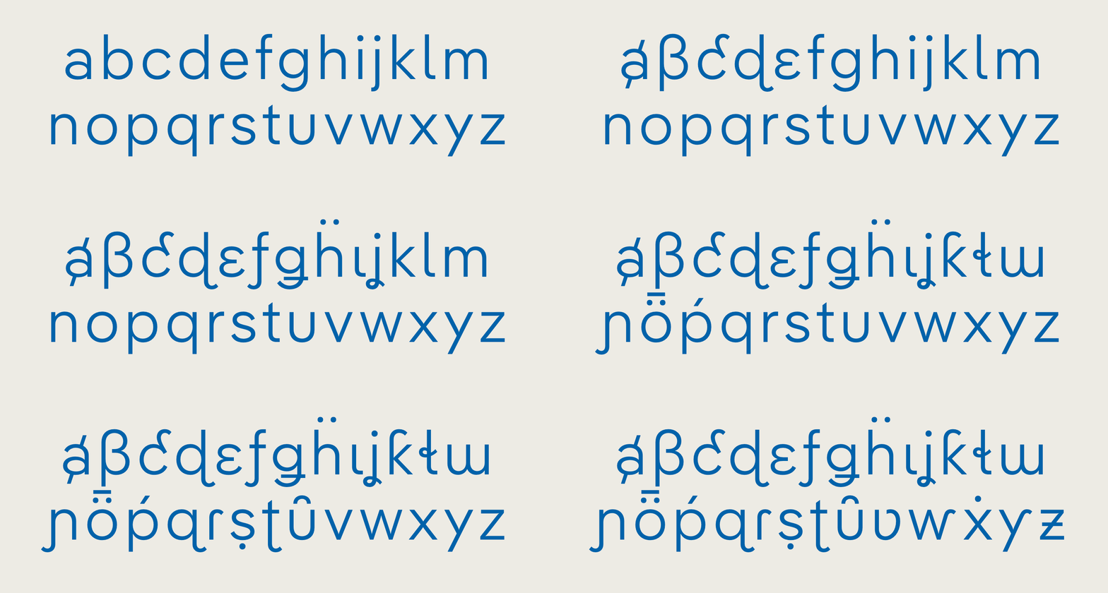
Diversity of forms in Pangea Afrikan
In my first article about Pangea, I described why this font is a matter of the heart for me; in addition to the aesthetic aspects, the continual expansion of the language support and the ongoing donations to socially responsible rainforest reforestation projects are of particular importance to me.
And the response so far has been overwhelming – I would never have thought it possible that just over a year after publication, my font could plant so many trees!
For me, this is just further motivation to push ahead with the language extensions, starting first with the completion of the Latin writing system where I feel at home.
A blind spot that only surprises at first glance
When Pangea was tested using the essential and excellent Hyperglot, astonishingly large gaps still opened up in the Latin-based languages. How could that be? After all, I had made sure from the very beginning that the language support was (in my opinion) above average and I had even drawn the stacked accented letters for Vietnamese‽
I had to do some research to find the answer and here I’m going to go back a little before we can go forward.
A (very) brief history of Latin character sets
From the 1980s onwards, the first digital PostScript fonts were limited to 256 characters, which meant that individual fonts could only support a very limited set of languages. Attempts were made to group them geographically, and so character sets were created for “Western” (e.g. French, German, etc) and “Central European” languages (CE for short; Czech, Polish, etc).
But it wasn’t until the 1990s, with the introduction of TrueType/OpenType fonts and the Unicode standard, which assigns a unique code to virtually every character in the world, that the shackles could be loosened and the fragmented character sets combined.
Market leader Adobe had the glorious idea of dividing fonts into “Std” and “Pro”, whereby the former could contain hundreds of ligatures, small caps and alternative forms, but the language support remained limited to “Western” languages. While, on the other hand, “Pro”, purely meant that more languages were supported; usually a summary of the European character sets mentioned above.

If your favourite players are called İlkay Gündoğan or Dušan Tadić, it is better not to use a “Std” font (like Stencil Std here). And the search for a font for Kelechi Ịheanachọ might be even more difficult.
Although the nonsensical distinction has, in the meantime, largely disappeared (despite many imitators and an astonishing tenacity!), the basic Latin character set has survived virtually unchanged as “Latin Extended” in many type foundries to this day.
Yet it is now about 25 years old! Since then, the Unicode standard has been widely supported and has grown by over 100,000 characters, and the world has become closer than ever thanks to the Internet and co.
“Latin Extended”‽
Character codes are divided into blocks in Unicode, and right at the beginning, the aforementioned PostScript character sets were grouped together in the closed block called, Latin Extended A. However, there’s a problem with this, a complete “drawer” of characters gives type designers a feeling of having something that is whole or complete and in this case, even something that is apparently “extended”, i.e. above average.
But this is not the case. It is a compilation that contains some deprecated characters that one can safely dispense and where the notion of “extended” language support is questionable. The original name of the block was much more meaningful and a true reflection of what the block contained: “European Latin”
And the rest of the world?
So far, a standard has been established for Latin scripts that is largely limited to Europe and the USA. For some languages, no “exotic” characters are needed and they are supported more or less by chance.
For others, the situation is worse: When it came to “donating” their Latin alphabet to colonised peoples, Europeans were very quick. However, additional character variants were developed for many languages, and even today, they are often omitted even from the most successful fonts.

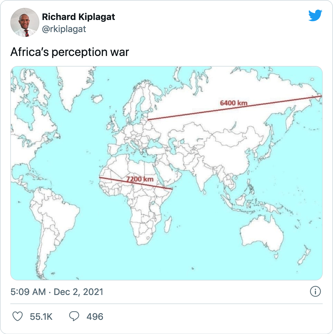
From Mercator projection to character set: Africa is perceived as too small. (Tweet by Richard Kiplagat)
The gaps in Pangea’s character set were thus unsurprising: they mainly concerned languages from other continents, especially Africa. And by no means just because there are always a lot of additional characters to be designed:

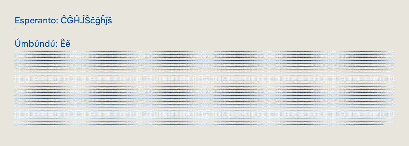
One dot = 1000 speakers! Almost every font supports the artificial language Esperanto (1000 speakers – yes, there’s a dot below “Esperanto”). Yet the two accented letters for Úmbúndú (Angola, 10 million speakers) are mostly missing.
Why this limited standard has remained almost unchanged for so long, however, remains questionable. I think it’s a mixture of convenience (we’ve always done it that way), market economy (the extra effort doesn’t pay off), ignorance and lack of knowledge or poor documentation.
The latter is especially true for younger designers and smaller foundries, and I’m not excluding myself there. Traditionally a lot is copied in type design, including technical standards. Here in particular, when in doubt, you trust the established foundries with their supposedly great expertise. And if their standards don’t evolve or adapt, then things don’t change.
For me personally, this had three consequences:
1. Pangea should support all living Latin languages
I started researching in January 2019 and I am happy that almost two years later, with the latest update, Pangea not only supports all the Latin languages in Africa, but all 459 listed on Hyperglot!

Pangea’s ≈350 new characters
Pangea remains true to its principle: as the language support grows, the price remains the same, and so does the donation to the rainforest. (If you have already bought Pangea, you can download the latest version for free.)
2. Pangea should be easily accessible to underprivileged Latin languages

Showing for Pangea Afrikan by Fungi Dube
With Pangea Afrikan I have defined a subfamily of Pangea that is intended to support all Latin-based African and indigenous languages. Like Pangea Afrikan Text, this family’s standard licence is free! I am pleased that Fontwerk supports this idea and hope that it will give as many designers as possible worldwide, whose mother tongues are often neglected, access to a contemporary typeface.

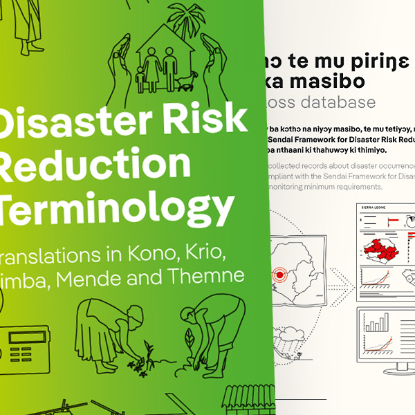
As luck would have it, my wife Katja and Gosia Warrink were designing a dictionary for the United Nations Development Programme in the languages Kono, Krio, Limba, Mende and Themne, and many characters could not be represented with the fonts used. So this became the premiere use of Pangea Afrikan, and I am happy that it was able to prove itself in practice for the first time!
→ Download Pangea Afrikan free of charge from Fontwerk
3. Pangea shouldn’t remain alone
Expanding a font may not be a bad thing. In fact, it’s even better to give others the opportunity to expand other fonts accordingly. Based on my research, I have therefore defined new, contemporary character sets that will hopefully bring some movement into the outdated standard: Latin S, Latin M, Latin L and Latin XL
Latin S is the basis; bigger than ye olde Latin Extended and yet deliberately named so that it becomes clear how it is not really “Extended” in the true sense of the word.
→ Latin S–XL character sets on Github
PS
To be precise: Pangea Afrikan is actually Pangea Afrikan Latin, so it’s a start for now. I am looking forward to working with Tapiwanashe Sebastian Garikayi, with whose help Pangea will hopefully soon support other African scripts.
I would like to thank Paul Hanslow for giving me valuable feedback on Pangea Afrikan’s character set and design, and Gabriel Richter for the Italics!
By the way: Pangea Afrikan also has its own soundtrack! Enjoy!
English translation by Lucy Beckley
Hallo! I’m Christoph Koeberlin; Type Designer & Font Engineer from Berlin, Europe. I design retail typefaces (like Pangea, Fabrikat & FF Mark), and custom typefaces (like for Mercedes-Benz, Liebherr & Mainz 05). For more than 10 years I’ve been assisting type foundries (like Swiss Typefaces, Grilli Type, FontFont and HVD Fonts) with mastering, QA, hinting & trouble shooting (for clients like Ebay, Lufthansa & Volkswagen). I founded sportsfonts.com & Typefacts. I look forward to your mail: christoph at koe.berlin. You can also meet me on LinkedIn & Twitter. I’m not on Facebook or Instagram, I don’t buy at Amazon, and I don’t use Google. All of my work is done with renewable energy. This beautiful typeface is Bery Script by Fred Smeijers.